A logo is something that represents or symbolizes a business, an organization, or an individual. It has to be well thought out and should show relevance as to why it was chosen. If you are planning to start your own venture, find a logo that will fully speak for itself.
There are logo designs online that you can download anytime. These logos come in different shapes and styles. Sometimes they are kept minimal with only letters and basic lines. But, in some other times, they are made with 3D effects and other stylish aspects. Find a template now to get started with your own.
Business Logo Templates
Business Logo Template in PSD
Cleaning Business Logo Template
Business Letterhead Logo Template
Free Vector Business Logo Design
Company Logo Templates
Construction Company Logo Template
Software Company Logo Template
Security Company Logo Template
Film Company Logo Template
Builders Logos
Free Abstract Construction Vector Logos
House Logo Design Vector Template
City Builder Logo
Eden Builders Logo
High End House Builder Logo
Church Logo Templates
Church Logo Template in PSD
Blue Logo with a Cross
Creative Church Logo Design Set
Church Youth Logo Template
Church Logo Design
What Are the Parts of a Logo?
A logo is composed of different parts even if it is made to be a simple one. These components complete a logo that represents a certain entity, a business, or an organization. When designing one, you need to pay equal attention to all and not just a single portion of it. To help you with that, here are three major parts of a logo that you should work on whether you are doing it from scratch or you are using a logo design you got online.
Color Scheme
The colors you use in a logo should mean something. It is not used just because it is aesthetically pleasing as it is. These colors should encompass the values, principles, and goals of what it represents. You can search for colors and their meanings to help you find the most appropriate one to use for your own. Although some would pick out colors just by choice especially when the logo is for commercial use. Whichever you choose, make sure that it balances out the overall design of your layout including the text color you want to use. Logo design templates that you can find online are in different color schemes to give you options left and right.
Graphic
Illustrations in a logo, like the colors, portray the essence of what it represents to anyone who sees it. These graphics are there to symbolize the mission and vision of the individual or the group. For one, some use laurel leaves to show their appreciation for wisdom. Little objects like that make up the whole value of a given logo. Furthermore, what you see in the graphics of a logo may also include the letters that represent the group. It can be the initials of the institution or the individual, or it can be of foreign letters that have a deep meaning that applies to the principles of what the logo should carry on.
Typography
Fonts used in a logo should not just be anything that you decide on randomly. You need to pick the most appropriate one that will put emphasis on any text that accompanies the graphic. Some would prefer Serif styles over scripts because they are easier to read. Although, an exemption to that is the Blackletter and Lombardic script which are commonly used as well. Using the proper fonts would make an impact on your logo. It helps people interpret why and how your logo came to be. When using a pre-made logo design, you already have a default font face to use which lessens the time for you to examine one after another that would look best.
DJ Logo Templates
DJ Logo Vector Template
Free Vector Collection of DJ Music Logos
DJ Logo Template in AI and EPS
Skull DJ Logo Template
Education Logo
Free Vector Education Logos Pack
University Education Logo Template
Education Institute Logo
Agriculture Education Logo
Education Logo Vector
Electrical Logo Templates
Modern Electric Logo
Free Vector Electrical Lightning Logo
Electric Logo Template in Vector Illustration
Electric Car Logo Template
How to Avoid the Common Mistakes When Making a Logo?
Mistakes are inevitable when making a design for something. This can be a result of lack of judgment from the human eye or can simply be a common error that was overlooked upon planning. Whatever the reason may be, there are still ways and means on how you can avoid this from happening. There are things that you should look out for and some things that you should improve. Knowing what these mistakes are will help you work on your design without worrying about how the outcome will be. Here are few smart design tips to help you perfect your next logo project.
- Stay away from the mainstream. While it is easy to join the bandwagon and design a logo like how the cliche ones are designed, it is more appropriate if you pick something new and refreshing. How else would people identify you and your uniqueness if you would look like something they always see out there. This is one way to stand out from your competitors. If your logo is different from the usual, people would notice you more if not instantly. You would draw in more crowd to see what you have to offer since you chose to be different from the current norm. People would consider you first since they would instantly think that you are different from their usual.
- Pay attention to colors. As what has been said above, colors are very important in a logo design or in any design in general. They bring life to your logo in brings more weight to a rather lifeless sketch. Given that, find colors that would pop; something that would stand out over your background without overshadowing overall look. Match colors together to perfect your layout. However, you should also make sure that your logo won’t falter when printed out or transformed in grayscale. Choose colors that are versatile and score the perfect look whether in full colors or in black and white.
- Keep it simple. You can never go wrong when you keep things simple, that’s the best thing about it. Logo designs do not have to be elaborate. I can be a simple checkmark or a bitten apple and people would still recognize you for it. This is because a logo is something that brands you and in some ways, you get to have a claim on it that no one else can. It is like your name but in the presence of an object imprinted on it.Another upside of a simple logo is that you don’t need the extra work for it. Moreso, opting for a simple logo will give you more time to work on polishing the said design.
Gaming Logo Templates
Gaming Logo Template in PSD
Gaming Clan Logo Template
Bluehead Gaming Community Logo
Vintage Style Game Play Joystick Logos
Salon Logo Templates
Hair Salon Logo Template
Collection of Hairdressing Logotypes
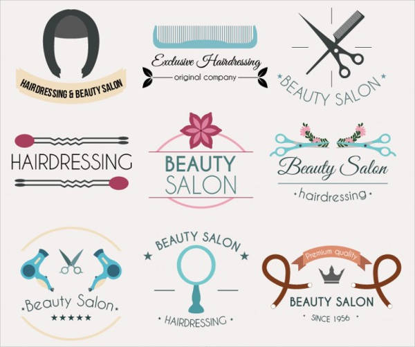
Beauty Care Logo Template
Jewelry Logo Templates
Free Jewelry Logo
Vintage Logo Frames Vector Template
Jewelry Logo Vector Set
Name Logos
Vintage Name Logo Designs
Monster Brand Logo Design
How Else Do You Improve a Logo?
- Customize and make it personal. Given that a logo is already unique from on to the other, why is it necessary to customize it? This customization is more on the free logo designs that you got online. Since it can be downloaded by the public, there is a greater chance that the designs have already been used by someone else. You can change the typography used or add something else to make the design more personal to your taste. But, do not overdo the changes and instead, work on fool-proofing the outcome.
- Keep the design symmetrical. No one wants to see a design that is out of place or curvy on the wrong sides. Balance the edginess of your design with the softness of the curves it has. You can use necessary grid lines or some guide outline to ensure that the design you are working on has the proper symmetry. Make the design more active than passive by choosing to make it point upwards than down. It adds to your final output the subtle wish and hopes of seeing the business prosper upwards. Logo designs that you can download online are already measured well to ensure its symmetry.
- Put reason over your creation. Last but not the least, value the reason why you are creating the logo. These reasons can be your principle, vision, goal, or even the values you believe. Put meaning in every component you add to your design. The importance of these components was already mentioned above. Understanding the need to add the parts to your design will help you justify to clients when you are doing the design for someone else and not for yourself.
Real Estate Logo Templates
Real Estate Logo Template in PSD
Vector Real Estate Logo Template
Premier Real Estate Company Logo
Real Estate Logo in EPS
Elite Homes Real Estate Logo
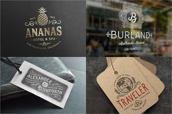
Vintage Logos
Vintage Logo Template in PSD
Free Retro Vintage Logo Template
Vintage Logo Template in AI
Modern Vintage Logos
Wedding Logo Designs
Vintage Wedding Logo Template
Black and White Wedding Logo
Wedding Monogram Logo
Water Color Wedding Logo
Sports Logo Templates
Sport Logo in EPS Template
Four Sport Logos Design
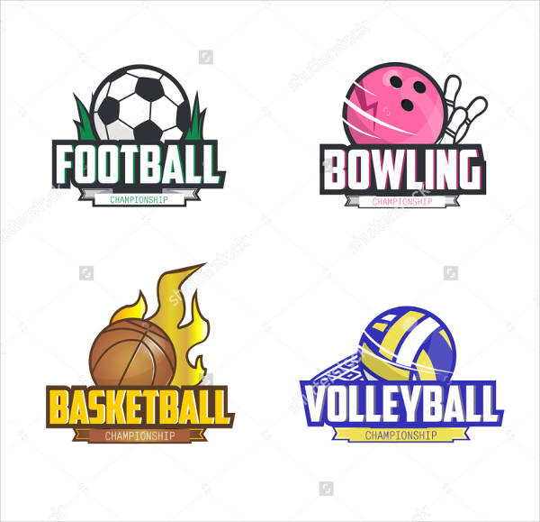
Volleyball Logo Template
Tennis Logo Template
Basketball Logo Template
The Types and Styles of Fonts You Can Use
As what was mentioned above, typography is important in a logo. And coming up with the right decision can be a burden on your part especially when you have thousands of font styles that you can choose from. However, not everything from this thousands is all applicable o use for all designs. Know which ones are appropriate for your design and know what to use for your next project. Here is a short guide to help you sort out the font styles available for your logo.
Serif
These are the font styles which look formal having originated from the old Roman type. The lines of the font are kept straight with its curve made perfectly and stop right at the spot where it meets with the lines. They are considered to be old school but still widely used. One common thing that is highly noticeable is that the small “e”, when written in Serif, would have a diagonal position instead of the traditional straight one. If you want something formal for your DIY logo, then this is the right pick. Some Serif font types include
- Old Style
- Transitional
- Neoclassical
- Slab
- Clarendon
- Glyphic
Script
This are not usually used together with graphical logos. This is because script fonts are already a standout by itself. Its elegant curls that curves on the right places as it forms that letter will definitely strike when seen for the first time. Ideally, you use this font for initials that you want to interlock with each other. Words that are used in this style are written big for legibility. Meanwhile, its substyle which is blackletter is mostly ued than its other styles. This is becausee it appears to be manuscript-like which can easily be spotted unlike with the calligrahy font styles. Some of the Script styles you would want to know:
- Formal Scripts
- Calligraphy Scripts
- Lombardic Scripts
- Casual Scripts
Sans Serif
Similar to Serif, Sans Serif was made based on it predecessor. However, unlike Sans, this style uses more of the square-type letters rather than the round ones. They also are heavier in weight stroke. Although in some letters, the edge is left to be curled to make it look aesthetically pleasing. Apart from all that, there is not much difference between the Sans Serif and the plain Serif font styles. Here are a few examples of Sans Serif:
- Grotesque
- Square
- Geometric
- Humanicstic
Decorative
This style is the informal one out of the four. They are not mostly used unless necessary and are not used when making formal logos. They are modern and stylish. Often, they arre in large blocks with a design outline and other times they are made to match a season such as Christmas and Valentines. Aside from that, grunge font styles as weel are considered to be decorative. They don’t often use proportional letters and the spacing of the font can be a challenge too. If you want something to go with an out of the blue design, this is a good catch.
Related Posts
35+ Downloadable Event Flyers in PSD
11+ Kids Birthday Invitations
11+ Swirl Pattern Designs
15+ Photoshop Floral Brushes
7+ Photoshop Smoke Brushes
8+ Event Invitation Templates
29+ Free Downloadable Brochures
41+ Product Packaging Designs
8+ Sports Brochures
6+ Watercolor Texture Designs
24+ Advertising Flyer Designs
19+ Bottle Label Designs
22+ Bottle Packaging Designs
10+ College Brochures
34+ Birthday Cards Download